Pimping My Type - Improving My Website's Typography
| 7 min read
A while back I wrote about website typography best practices. This post was based purely on my own research and nothing close to a professional opinion. The information in that post is still valid today and if you follow it, you are likely to improve the type on your website.
I've always been somewhat of a typography nerd, I just didn't know it. Whenever I visited a website with beautiful typography, they always piqued my interest.
A local font stack is all well and good, but Helvetica and Arial, et al are just...well...boring.
Anyway, since doing the research for the typography post, I discovered Oliver's YouTube channel and newsletter, Pimp My Type. He's a professional typographer, so when I learned that he offers free website typography reviews, I was on that like a tramp on chips!
Improving my typography - the video
After applying to have my website type reviewed by Oliver, he reached out and asked if I'd be up for doing it on video, rather than via email. I've never done anything like that before, but I though what the hell and said yes.
There will be a video of our conversation on Oliver's YouTube channel in the next few weeks. If you're interested in seeing that conversation, and others, I'd strongly encourage you to subscribe to his excellent channel.
So last week, Oliver and I jumped on Zoom and had a really great conversation (and some laughs). Honestly, I wasn't expecting much in terms of feedback - after all I'm using the time of typography expert here, for free.
Boy was I wrong!
Oliver went through my site with a fine-toothed comb, and an hour or so after our conversation started, I came away with a list of 15 things I could improve with my website's typography.
The list of improvements
It was a long list, so I won't list them all out here. But I did want to pick out a great example of where things fell apart in terms of my typography and the design of this site.
Ironically, a great example of this was my typography best practices post, as it contained a lot of elements, like notices and block quotes.
Notice boxes
First, let's take a look at notice boxes. Here's what they looked like before Oliver provided any feedback:

As you can see, both are completely different and the notice box can't actually decide if it's a block quote or note. Not great.
Oliver quite rightly said that they look completely different and should be more uniform. And to be frank, the red is horrible when used with the various blues that the rest of my theme uses.
I did some work, and here's what notice and warning boxes look like now:
This is a notice box. It's pretty nice, right?
This is a WARNING box. Make sure you don't do that thing!
As you can see, they both look very similar now, with the only difference being the icon at the top of the box. I think that's pretty uniform, right?
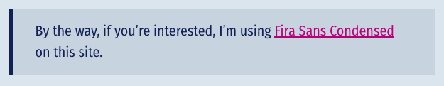
Also, notice the serif font I'm using? Yeah, that's new too. But more on that later.
Block quotes
Just like notice boxes, block quotes were all over the place and had very little consistence to them. Also, they were using the Georgia font, which doesn't go with my main font, Fira Sans Condensed.
There are two types of block quote that I use on this site. Big, and small. Small tends to be for longer quotes, and the big block quote is generally for one-line quotes to grab the reader's attention. This is what they looked like:
As you can see, they're completely different in their design. Plus, the small block quote looks a lot like the old notice, so it's confusing. Finally, the line height and padding is all jacked up on the large quote. It all needed an overhaul.
So I changed the design of block quotes so they have a single design that is similar, yet different enough from the notice boxes. Here's what I came up with:
This is the blockquote that I use for all quotes now. I think these look pretty good, don't you think?
Some person
As you can see, they're pretty much exactly the same. The only difference really is the font size.
As with my notice boxes, block quotes use a serif font, but it's no longer Georgia. Now I'm using Meta Serif Book which is actually the font that Fira is based off of. So they go together really well.
While we're talking about fonts; I also changed the font that I use for code blocks. Now I'm using Fira Mono, which again matches in perfectly as they're all from the same family.
Other changes
Some of the other changes that Oliver recommended were to the header for blog posts. Previously they looked like this:
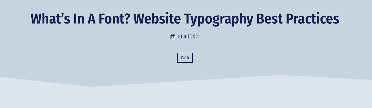
There's the title, the date, the calendar icon and the “button” that shows the post category.
Once again, I simplified the whole thing and gave the post title a bit more breathing room. Here's what it looks like now:
It's much more simplified and the title get's to really breath so that readers can take it in. The calendar icon has gone and the date/categories are on the same line.
I'm still not sure whether the category should be pink, like the rest of my links, I may change that in the future.
The footer
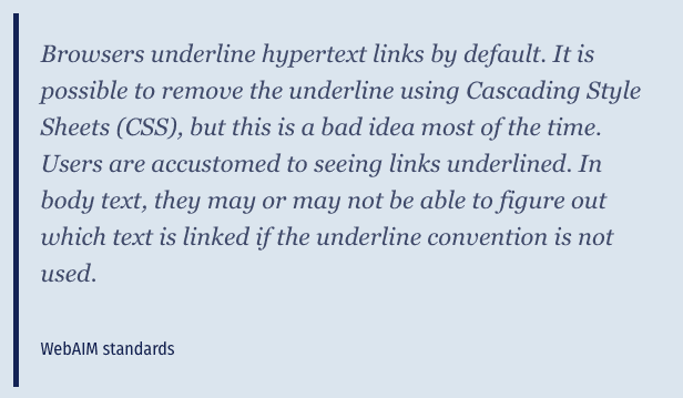
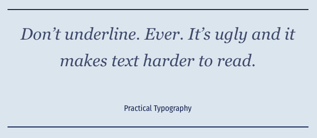
The other fairly significant change I made was to the footer. Previously all links were underlined, but this wasn't necessary as it's obvious they were all links. By underlining everything, it made the footer look busy.
Also, the Weird Wide Webring block wasn't as wide as the rest of the content, so it looked strange. Here's what the old footer looked like:
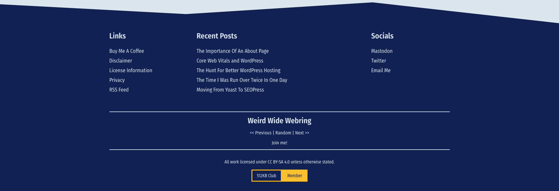
After some minor surgery, I think the typography has really improved on my footer. Here's what it looks like now:
Final thoughts
There were various other changes that Oliver recommended, all of which I've implemented. I think I've gone into enough detail in this post, so if you want to know about all the changes Oliver recommended, keep an eye on his YouTube channel to see our conversation.
Honestly, I think the typography on this site was pretty good before Oliver gave me any pointers. But now, I'm really happy with it. When you design a website yourself, it's easy to miss things that might not work, so a fresh perspective can be invaluable.
I really enjoyed my time chatting with Oliver, and I certainly got a lot from it. Hopefully, some of Oliver's viewers will get some valuable tips on what not to do from the video too.
If you want to improve the typography of your website, I'd strongly recommend checking out Olivers content. If email is more your thing, he has a newsletter too.
Subscribe for more!
You don't have to keep coming back here to read my latest waffle. There's a couple of way to subscribe to receive updates whenever I publish new content.